
Paint is a powerful element of design, It can create the illusion of a spacious room and can also blend your décor with modern furnishings. Starting with the colors you love is the simplest way to select the right interior paint colors. When you begin with the colors you adore, you are not constrained by the traditional color scheme for a specific decorating style. Continue reading to get some great tips as we guide you to creating the color palette that best suits your style, personality, and lifestyle.
Begin your inspiration:- When it comes to choosing paint colors, Pinterest is a great place to start. Make a board for each room and begin to pin rooms that are eye-catching. You’ll get a sense of what colors and styles appeal to you after you’ve collected about ten.
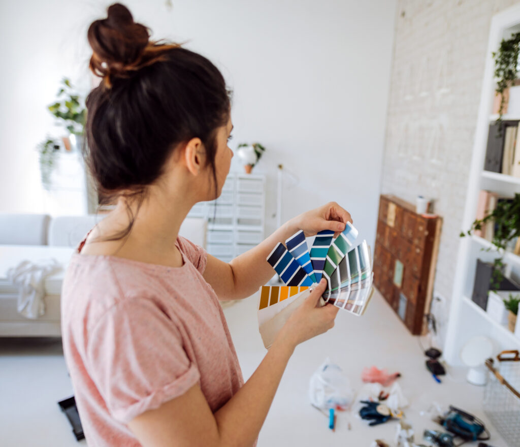
Color perception:- You do not need to be an expert in color theory to pick a color, the following terms can simplify color choices.

● Primary colors:- the colors, mixed in different quantities, produce all the colors. Red, Yellow, and Blue are the primary colors.
● Secondary colors:- the colors created by combining two primary colors. Green, orange, and violet are secondary colors.
● Hue:- the color variety. For example, Aqua is a hue of blue. Hue is often used interchangeably for color characteristics with tone tint, and shade.
● Tone:- grey pigment is mixed with a primary or secondary color pigment to achieve this hue. In light colors, white is more common than darker colors.
● Shade:- A hue created by combining the black pigment with a primary or secondary colored pigment. Shade and tint are often used interchangeably in everyday language to describe how light or dark a color appears.
● Warm colors: Red, green, and yellow tones. Warm colors frequently evoke images of fire as well as feelings of coziness and excitement.
● Cool colors: Blue, purple, and green tones. Cool colors evoke feelings of peace and relaxation, as well as depictions of water and nature.
Colors are chosen and described according to the mood in interior design. The mood of a color is how it makes the viewer feel.
● Passive Colours: Color with a calming effect that promotes mental focus and relaxation. Blues, greens, and purple are commonly regarded as passive colors. Passive colors are generally cool and soft. Passive color, which can make smaller areas more spacious, are popular choices for bedrooms.
● Active colors: Colors that energize the mind and produce a calming effect. Active colors include red, yellow, and orange. Warm and brightly toned colors are common in active colors. Colors that are bright and eye-catching are common for kitchen, office, and accent walls.
● Neutral Colours: Color shades that do not fit comfortably into one of the primary or secondary color families. Neutral colors include black, white, brown, grey and cream.
Create your color plan:- We strongly advise you to choose your wall color last. Wall paints are low-cost and can be made with any color or hue. Start with things that are more difficult to come by, such as furniture and rugs or carpets. Once you’ve decided on your furniture, you should move on to choosing a wall color. You may decide to use your color in your accessories rather than on your walls. This is preferred by many people. Others, on the other hand, prefer more neutral furnishings contrasted with bold and powerful walls.
Colour Tone:- Experiment with painting swatches and fabrics with your colors. Create floor plans and color schemes for your rooms. If they work on paper, try painting small sections of your walls. When painting sample areas, consider other rooms and how they connect so that you can create a flow from room to room to determine which colors complement each other. An adjacent room may want a neutral color, but on the contrary, you can work with contrasting tones, just as the flow appears always.
Where to begin with color? Start from the beginning. The starting point could be a central space or a front hall or entryway. It’s safer to use a soft neutral color for your hallway and corridor. Guest rooms and home offices are not often bright and bold, whereas children’s rooms are. If your bedroom has a bathroom attached to it, you do not have to paint both rooms the same color, but you should consider different shades of the same color. Color selection should be enjoyable and not stressful in any way. Don’t make any hasty decisions.
In short, you may now choose the right color for your interiors with these home painting color ideas.